Posts

Portfolio 3.0

Image
 Making my portfolio website was highly reminiscent of my art blog. It's just as customizable, but with the addition of the resume. I worried adding the photo was unprofessional, so I included the link to the document for reference. The program for making the portfolio website was odd- nothing like blogger, but It sectioned itself in separate boxes for customization. It was clunky but efficient. I tried to maintain the black and white collage image I added to my portfolio book for continuity. I use that image a lot for my headers now, but it didn't fit the aesthetic or the professional outlook of the overall website. I was going to pick another project I had done for this class, but I felt that I had already decided on the best work overall. I don't think any other project I had done was a better representation of the diversity in the digital medium. In other news, I should put greater attention into putting more work into my cumulative portfolio. I searched for different e

Behance - Portfolio

Image
       This week I had to tackle my portfolio again, but this time with this class! Before I compiled my work, I scrolled through the portfolios they had on the website, and I was more than surprised to see the number of artists with a wide range of selections in their portfolios. I suddenly remembered why I had to take this Three-dimensional course for my major- it’s to display that you have the capability and flexibility necessary for the arts. I have to take it upon myself not to master but understand that there are different mediums to work with and that I’m not confined to just one area of expertise. While I can specialize in that field, I can also show a greater understanding if I am more versatile.      Going back to my portfolio, I wanted to make sure I caught my best work, including the various photography assignments, the animation, and the photoshopped work I had done for this class. I was afraid of copyright issues for the Imagine video, so I decided to go with my calcifer

The Dreamers

Image
  Making the video for this particular project was tough, but I was familiar with one. I always mention my film classes, but it was my only experience with a decent video editor. The project I did was similar, too- we had to pick a song and visualize the lyrics through visuals. I chose NGHFB’s Dying of the Light and various scenes from Richard Ayoade’s film,  Submarine . I think there was also clips from End of the F***ing World in there... it's been awhile. In high school, I didn’t use stock footage at all. Instead, I decided that it'd be a good idea to use copyrighted movies-But now, knowing better, I did my new video entirely with stock footage. (I’ll include the video I did back in high school below, along with my final video for this project for comparison) I chose John Lennon’s Imagine out of the three songs for this new one. This song is heavy in tone, to which I could probably have this slow, melancholy mood but pick up when the chorus starts, and it has fast cuts. Sinc

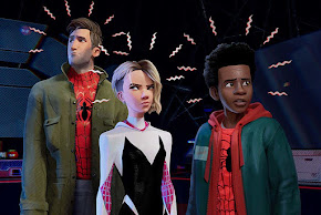
What's up Danger? - A dive into Spider-man: Into the Spider-verse

Image
  Researching further into Animation has inspired me to look into the productions of some of my favorite animated features as of late—specifically, the production of the film,  Spider-man into the Spider-verse.   The Oscar-winning film for Best Animation was a phenomenal success at the box office and profoundly affected the animation industry.           In Into the Spider-verse , we follow Miles Morales and his journey with Accepting Social Responsibility and what it means to be Spiderman. I am grateful for the writers Phil Lord and Christopher Miller because their vision for this movie was fantastic. The aesthetic captures that comic book-like quality. Animators stated that they animated without motion blur instead of motion smearing. The frame rate also varied from 24 to 12 images per second, creating that choppy effect that is noticeable when any of the characters move. The textures of the backgrounds and the characters have that printed dotted film as a printed comic book would. T

May All Your Bacon Burn

Image
  “The creation of a single world comes from a huge number of fragments and chaos”  -Hayao Miyazaki  Animation has been a lifelong dream of mine- Much like any kid growing up, I was constantly consuming the visual media that is animation. From Movies, TV shows and games- I was always taking in some animated entertainment. Many of the reasons I started drawing were because of video games. While I wanted to do character design for video games at first, I grew a greater appreciation for animation. It often gets sidelined as strictly a medium for kids, but it's much more than that. Animation is a medium, and any story, targeted at kids or adults, is helpful in its storytelling aspects. It provides more significant space for creativity and anything beyond the confines of reality. We've seen beautiful examples in adult animation, from Animatrix, Anomalisa, to Loving Vincent; animation has proven to be much more than the fundamentals of film making. For this project, I was inspired by

Art Through The Looking Glass

Image
 “The world is a looking glass and gives back to every man the reflection of his own face.” - William Makepeace Thackeray One of the biggest challenges this week was making this book series. I had flashbacks to my High School Yearbook years since the program is very similar to the editing program. I thank the heavens for that because I get stressed when learning a new program- this one was a breeze!   I chose to make a portfolio for my book theme since I already had a compilation of photos from all my works. I recently decided to use the more “professional” pieces since I mostly do fanart for my general drawings. I was inspired mainly by Jamie Hewlett’s art book. It helped me tremendously with the formatting and the overall layout of the book. My favorite color is red, so I chose this as my base color for the cover. I also chose this lovely png of drawn lilies to accent the corners of the cover. The interior pages are an edited photo of a collage I did back in High School.(I also inclu

Tubman and the Twenty

Image
 Illustrator, the app I’ve been waiting to use for a long time- Is finally here! I’ll be honest, using the programs was problematic as is. The tools were utterly foreign to me, and it was hard to manage, but I persisted. This week’s project was to redesign the twenty-dollar bill with Harriet Tubman, and I was intrigued by the challenge. Unlike the portal to another world, there is a specific quota I must fill rather than go all-out crazy. I decided to keep it simple for the project and preserve the likeness of Tubman. I found this particular picture of  Tubman perfect for the center, and I envisioned it in that dollar etching style. While I can draw, I found this particularly difficult because there is immense detailing on our dollars, even if we don’t notice them. It was fun to dissect the iconography of the dollar because, much like the one dollar, there were symbols embedded into the dollar. While I could get caught up in the finer details of a project, I decided to put my focus mai